Red Dot Global Foundation Design System 1.0: Building Accessible UI for 20+ Countries
A purpose‑built system of tokens, patterns, and components that helps teams tell clearer stories about impact, collect funds reliably, and keep every digital touchpoint inclusive and consistent.

Other than standard web components, created elements tailored to donations, programs, impact storytelling, and accessibility.
Foundations
Category | Items |
|---|---|
Color | Brand/mission palette, neutrals, success, warning, fundraising accent, background tokens, border tokens, chart palettes |
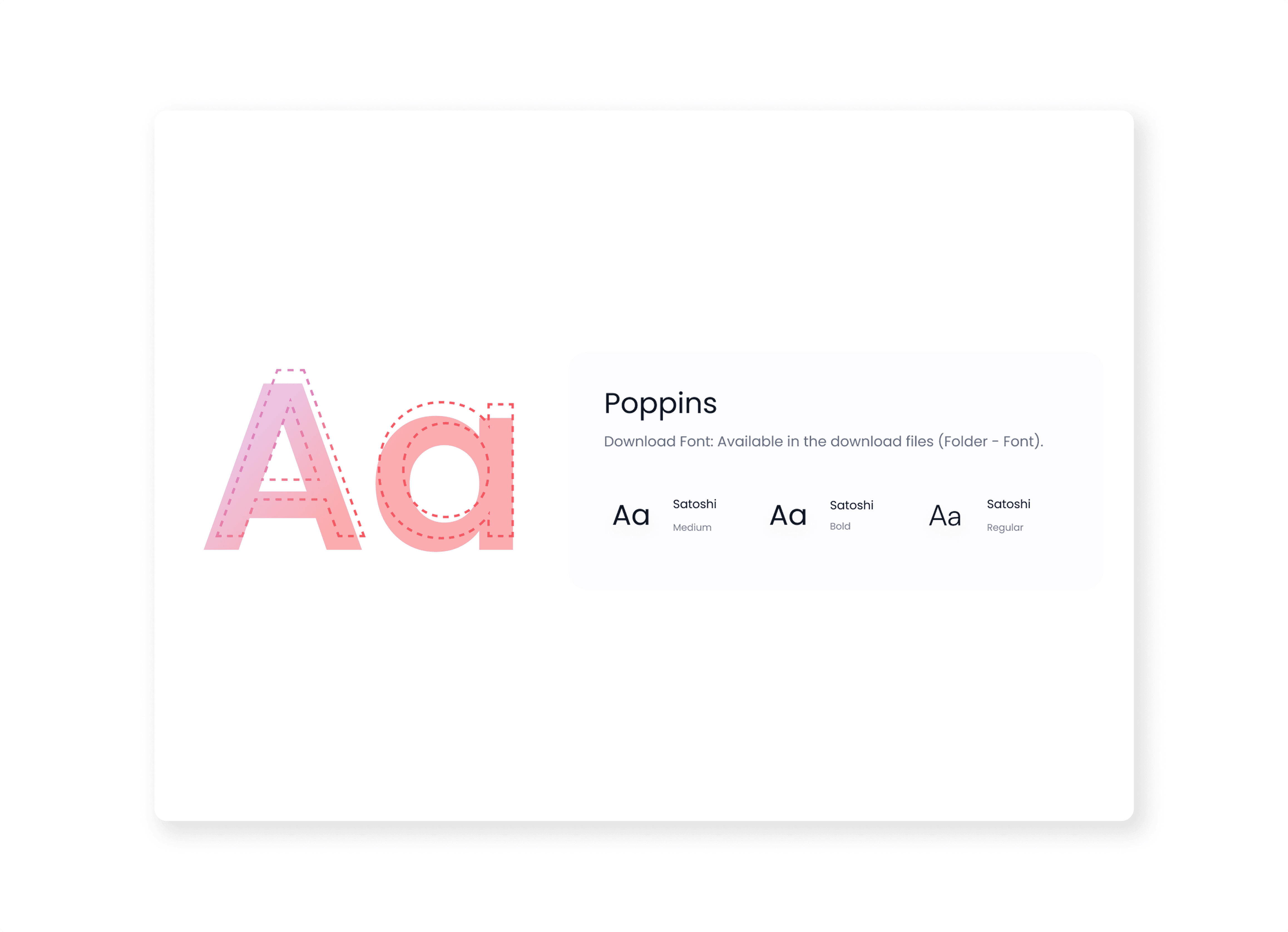
Typography | Display, heading, body, caption styles; numeric styles for KPIs and finance; language/locale variants |
Spacing & Layout | Spacing scale, grid, breakpoints, max widths, gutters, container patterns |
Elevation & Shape | Border radius scale, shadows, dividers, overlays, modals elevation |
Icons & Illustration | Cause icons (education, health, climate, etc.), action icons, empty‑state illustrations |
Core UI Components
Category | Components |
|---|---|
Actions & Feedback | Primary/secondary/tertiary buttons, icon buttons, FAB, snackbars/toasts, inline alerts, banners, critical alerts |
Inputs & Forms | Text inputs, text areas, email/phone inputs, amount input with presets, currency selector, date/time pickers, select/dropdown, segmented controls, radio groups, checkboxes, switches, sliders, file upload |
Layout & Content | Page header, section header, campaign card, story/impact card, program card, volunteer opportunity card, partner/sponsor card, statistic/KPI card, media block, testimonial block, dividers |
Navigation | Top nav bar, side nav, tabs, breadcrumb, pagination, stepper |
Data Display | Tables (donations, grants, volunteers), summary rows, progress bars, progress rings/donuts, timelines, tags/pills, badges, chips |
Specific Components
Category | Components |
|---|---|
Donation & Fundraising | Donation widget (presets + custom), match‑funding banner, impact breakdown module (“₹X = outcome”), recurring donation manager, donation receipt card |
Programs & Impact | Program overview card, impact dashboard widget (filters + KPIs), map view for projects, year‑in‑review module |
Volunteers & Community | Volunteer role card, volunteer application form pattern, shift scheduler, volunteer profile card (hours, badges, causes) |
Governance & Transparency | Financial transparency block (spend breakdown), policy/document list, board/leadership cards |
Patterns
Pattern | Description |
|---|---|
Donation Flow | Multi‑step donation (details → summary → payment → confirmation + receipt) using donation widget, stepper, alerts |
Campaign Page | Hero, campaign stats, story content, updates, FAQ, donation module, social share |
Grant / Application Flow | Long form with save‑draft, document upload, review step, confirmation screen |
Impact Dashboard | Filters, KPI tiles, charts, tables, map; supports program/region views |
Account / Profile | Personal details, organisation info, preferences, consent/privacy settings |
Onboarding | Mission intro, cause selection, suggested campaigns/programmes, email preferences |
Other than standard web components, created elements tailored to donations, programs, impact storytelling, and accessibility.
Foundations
Category | Items |
|---|---|
Color | Brand/mission palette, neutrals, success, warning, fundraising accent, background tokens, border tokens, chart palettes |
Typography | Display, heading, body, caption styles; numeric styles for KPIs and finance; language/locale variants |
Spacing & Layout | Spacing scale, grid, breakpoints, max widths, gutters, container patterns |
Elevation & Shape | Border radius scale, shadows, dividers, overlays, modals elevation |
Icons & Illustration | Cause icons (education, health, climate, etc.), action icons, empty‑state illustrations |
Core UI Components
Category | Components |
|---|---|
Actions & Feedback | Primary/secondary/tertiary buttons, icon buttons, FAB, snackbars/toasts, inline alerts, banners, critical alerts |
Inputs & Forms | Text inputs, text areas, email/phone inputs, amount input with presets, currency selector, date/time pickers, select/dropdown, segmented controls, radio groups, checkboxes, switches, sliders, file upload |
Layout & Content | Page header, section header, campaign card, story/impact card, program card, volunteer opportunity card, partner/sponsor card, statistic/KPI card, media block, testimonial block, dividers |
Navigation | Top nav bar, side nav, tabs, breadcrumb, pagination, stepper |
Data Display | Tables (donations, grants, volunteers), summary rows, progress bars, progress rings/donuts, timelines, tags/pills, badges, chips |
Specific Components
Category | Components |
|---|---|
Donation & Fundraising | Donation widget (presets + custom), match‑funding banner, impact breakdown module (“₹X = outcome”), recurring donation manager, donation receipt card |
Programs & Impact | Program overview card, impact dashboard widget (filters + KPIs), map view for projects, year‑in‑review module |
Volunteers & Community | Volunteer role card, volunteer application form pattern, shift scheduler, volunteer profile card (hours, badges, causes) |
Governance & Transparency | Financial transparency block (spend breakdown), policy/document list, board/leadership cards |
Patterns
Pattern | Description |
|---|---|
Donation Flow | Multi‑step donation (details → summary → payment → confirmation + receipt) using donation widget, stepper, alerts |
Campaign Page | Hero, campaign stats, story content, updates, FAQ, donation module, social share |
Grant / Application Flow | Long form with save‑draft, document upload, review step, confirmation screen |
Impact Dashboard | Filters, KPI tiles, charts, tables, map; supports program/region views |
Account / Profile | Personal details, organisation info, preferences, consent/privacy settings |
Onboarding | Mission intro, cause selection, suggested campaigns/programmes, email preferences |