The 4-Minute Quote: Re-engineering Global Logistics

Overview
Freight forwarding is a battle of margins. Operators traditionally lose hours manually comparing "Spot" prices (live market rates) against "Contract" prices (pre-negotiated rates). I led the design of Cacta’s core Rate Engine, transforming a fragmented 4-hour manual search into a 4-minute automated decision.
Impact
From Data Dumps to Quick Decisions
20% → 8% Lost Quotes
Created search engine which saved 15+ hours per week for every operator. 87% reduction in manual decision time.
4+ hrs→ 7min Quotes
Manual spreadsheet hell became instant AI spot rates. Reps handle 90% autonomously vs constant pricing pings.
87% AI Rate Acceptance
Reps ignored AI quotes without trust signals. Led confidence widgets + explainable UX across product/eng/data teams. Drove 87% acceptance vs 35% baseline.
Complexity → Clarity
Tokenized design system turned dense tables into scannable insights. By aligning design tokens with engineering variables, we halved the time it took to move from mocks to live production code.


The Problem
The Burden of Manual Interpretation
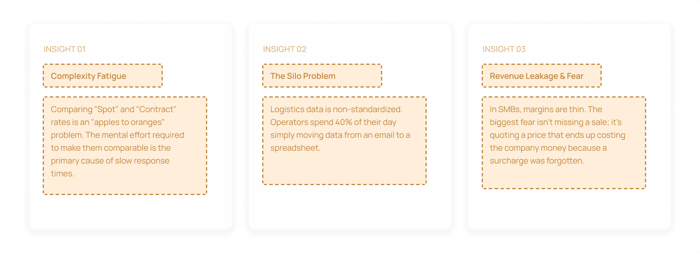
Freight forwarding is a battle of razor-thin margins. Through user interviews with SMB operators, I discovered that quoting wasn't just a data retrieval problem; it was an Interpretation Problem.
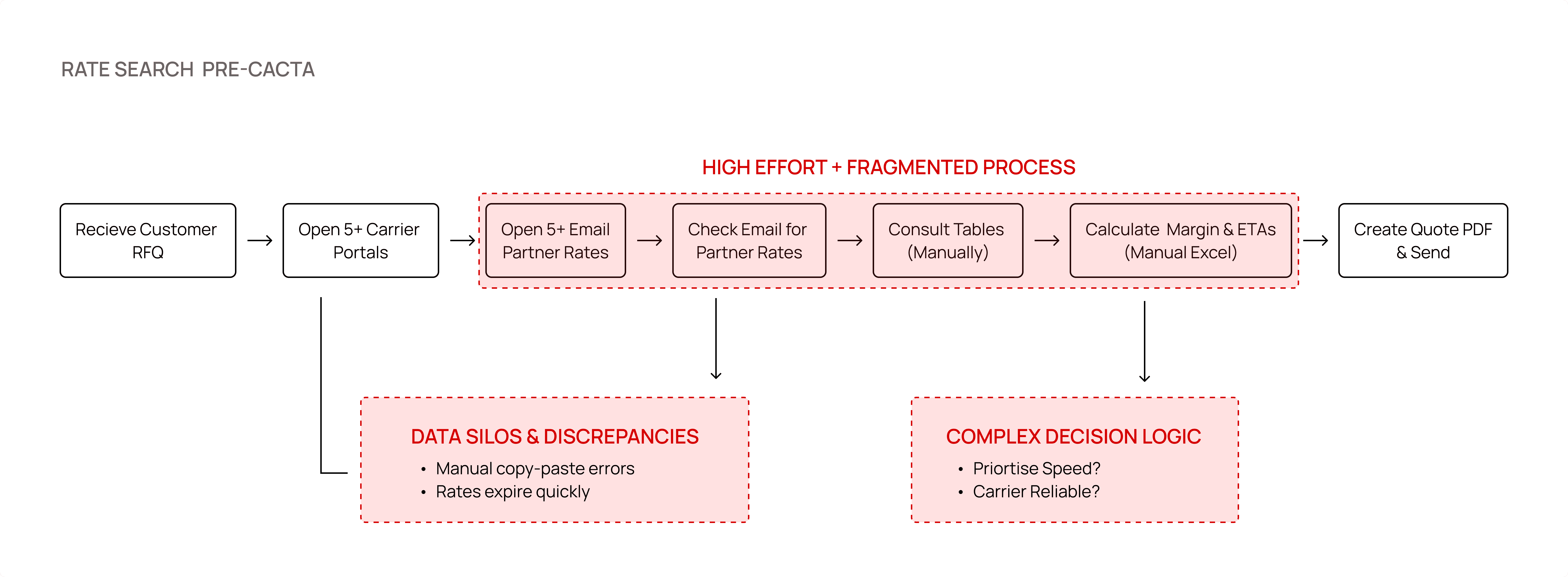
The Workflow Chaos: Operators spent 4+ hours per quote, toggling between 5+ carrier portals and endless email threads to find "Agent Rates" and "NAC Filings."
The Fragmented Core: Spot prices (live market) and Contract prices (pre-negotiated) lived in silos. Comparing them required manual Excel calculations for surcharges, leading to frequent "revenue leakage" from missed fees.
The Challenge
Bridging the "Black Box" Gap
The Goal: Transform a complex backend algorithm into a scannable, "Explainable AI" interface.
Cacta’s core USP is a backend AI algorithm that makes Spot and Contract rates comparable for the first time. However, the initial engine output was a "data dump" that users didn't trust because they couldn't see the math.
Defining the User
I identified the SMB Operator as our primary user because they act as the "Human API". This person manually bridges the gap between carrier data and customer quotes.
The Strategy
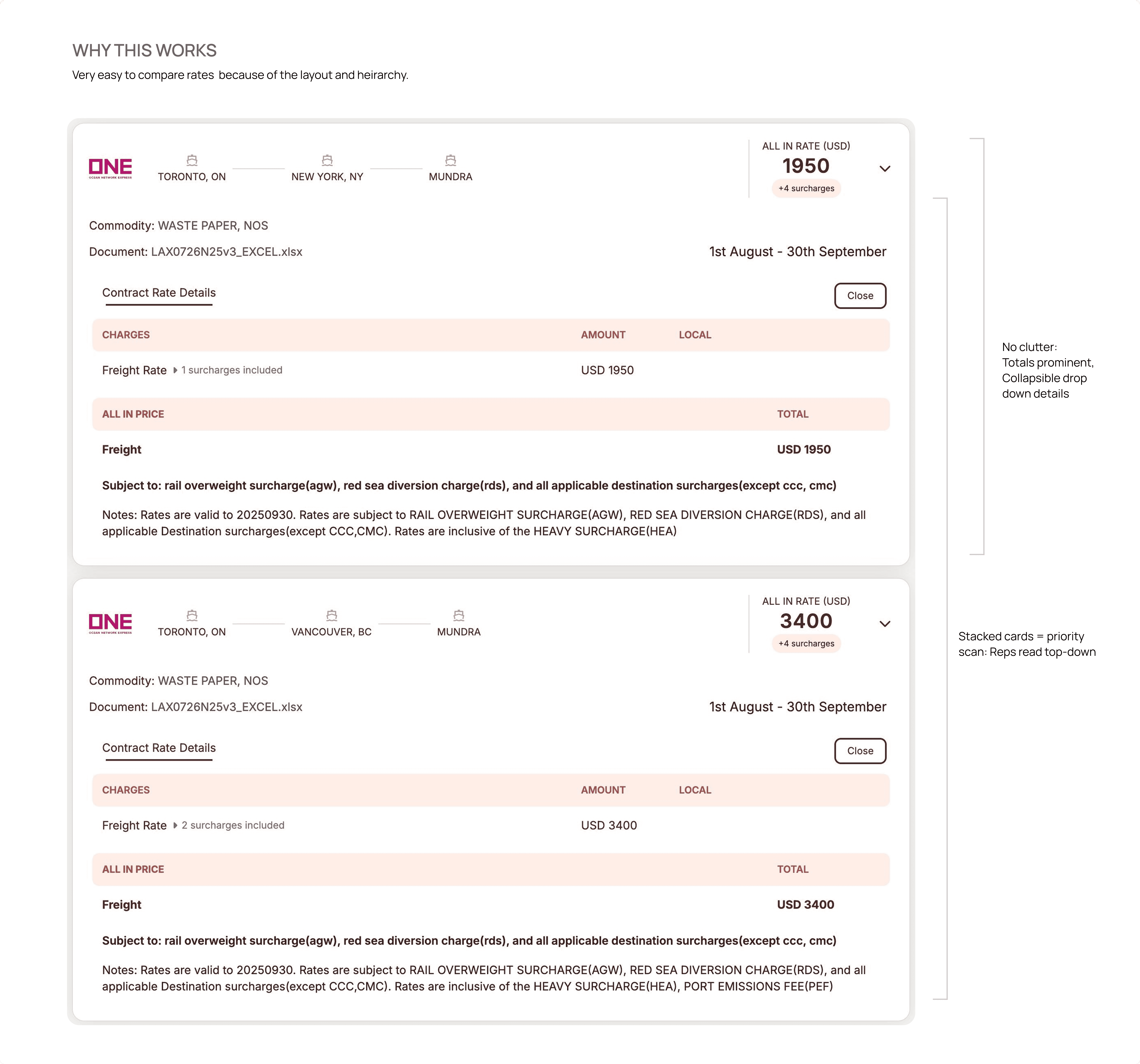
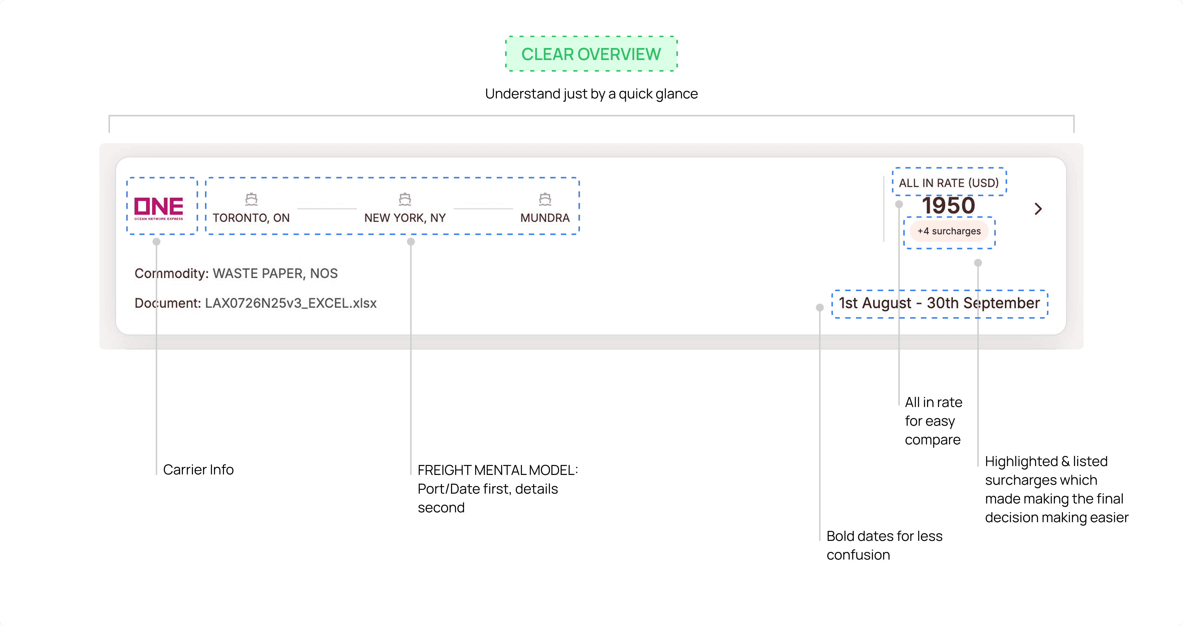
Making "Apples to Apples" Possible
The heart of the project was the Spot vs. Contract Comparator. I moved away from vertical lists to a High-Density Comparative Grid.
Algorithmic Transparency:
I designed a logic-heavy sidebar that pulls line items like BAF (Bunker Adjustment Factor) and Peak Season Surcharges automatically.
Haulage-Inclusive Quotes:
I led the eng collab to integrate "Last Mile" trucking costs directly into the comparison, ensuring the AI's "Best Option" highlight accounted for the full journey.
Translating Complexity into Scannability
Working shoulder-to-shoulder with the Lead Engineer, I owned the creation of a Tokenized Pricing System.
Visual Cues:
We implemented color-coded paths to distinguish between Direct and Transshipment routes (e.g., Hapag-Lloyd VALIANT).
Best-Option Highlight:
A subtle but high-contrast "Optimal Path" badge was created to guide the user to the highest margin option identified by the AI.
Learnings & Reflections
Trust is a UI Component:
In AI-driven products, users don't need to see the code, but they need to see the evidence.
Systems Over Screens:
Mastering the haulage-inclusive logic required deep collaboration with devs to ensure our design tokens mapped perfectly to the backend's pricing variables.
90% Faster Turnaround
Quotes that took hours now take minutes.
3x Previous Volume
Allowing small teams to work more efficiently.
120h+ Saved/ Month
Reducing manual spreadsheet work.(Per User)
More Accurate Quotes
Reduced missed surcharges during final reconciliation
Overview
Freight forwarding is a battle of margins. Operators traditionally lose hours manually comparing "Spot" prices (live market rates) against "Contract" prices (pre-negotiated rates). I led the design of Cacta’s core Rate Engine, transforming a fragmented 4-hour manual search into a 4-minute automated decision.
Impact
From Data Dumps to Quick Decisions
20% → 8% Lost Quotes
Created search engine which saved 15+ hours per week for every operator. 87% reduction in manual decision time.
4+ hrs→ 7min Quotes
Manual spreadsheet hell became instant AI spot rates. Reps handle 90% autonomously vs constant pricing pings.
87% AI Rate Acceptance
Reps ignored AI quotes without trust signals. Led confidence widgets + explainable UX across product/eng/data teams. Drove 87% acceptance vs 35% baseline.
Complexity → Clarity
Tokenized design system turned dense tables into scannable insights. By aligning design tokens with engineering variables, we halved the time it took to move from mocks to live production code.
The Problem
The Burden of Manual Interpretation
Freight forwarding is a battle of razor-thin margins. Through user interviews with SMB operators, I discovered that quoting wasn't just a data retrieval problem; it was an Interpretation Problem.
The Workflow Chaos: Operators spent 4+ hours per quote, toggling between 5+ carrier portals and endless email threads to find "Agent Rates" and "NAC Filings."
The Fragmented Core: Spot prices (live market) and Contract prices (pre-negotiated) lived in silos. Comparing them required manual Excel calculations for surcharges, leading to frequent "revenue leakage" from missed fees.
The Challenge
Bridging the "Black Box" Gap
The Goal: Transform a complex backend algorithm into a scannable, "Explainable AI" interface.
Cacta’s core USP is a backend AI algorithm that makes Spot and Contract rates comparable for the first time. However, the initial engine output was a "data dump" that users didn't trust because they couldn't see the math.
Defining the User
I identified the SMB Operator as our primary user because they act as the "Human API". This person manually bridges the gap between carrier data and customer quotes.
The Strategy
Making "Apples to Apples" Possible
The heart of the project was the Spot vs. Contract Comparator. I moved away from vertical lists to a High-Density Comparative Grid.
Algorithmic Transparency:
I designed a logic-heavy sidebar that pulls line items like BAF (Bunker Adjustment Factor) and Peak Season Surcharges automatically.
Haulage-Inclusive Quotes:
I led the eng collab to integrate "Last Mile" trucking costs directly into the comparison, ensuring the AI's "Best Option" highlight accounted for the full journey.
Translating Complexity into Scannability
Working shoulder-to-shoulder with the Lead Engineer, I owned the creation of a Tokenized Pricing System.
Visual Cues:
We implemented color-coded paths to distinguish between Direct and Transshipment routes (e.g., Hapag-Lloyd VALIANT).
Best-Option Highlight:
A subtle but high-contrast "Optimal Path" badge was created to guide the user to the highest margin option identified by the AI.
Learnings & Reflections
Trust is a UI Component:
In AI-driven products, users don't need to see the code, but they need to see the evidence.
Systems Over Screens:
Mastering the haulage-inclusive logic required deep collaboration with devs to ensure our design tokens mapped perfectly to the backend's pricing variables.
90% Faster Turnaround
Quotes that took hours now take minutes.
3x Previous Volume
Allowing small teams to work more efficiently.
120h+ Saved/ Month
Reducing manual spreadsheet work.(Per User)
More Accurate Quotes
Reduced missed surcharges during final reconciliation