47% Onboarding-Driven Support Ticket Reduction

Overview
Metabolic health is the quiet engine of longevity, yet our internal chemistry remains a mystery until it fails. Continuous Glucose Monitors (CGMs) promise total transparency, allowing high performers to live better by listening to their blood.
However, raw glucose data lacks immediate meaning. Traditional logging feels like a chore, showing "what" is happening through jagged curves without explaining "why." This causality gap leads to data fatigue rather than behavioral change.
We built a metabolic intelligence system that starts at unboxing. By moving onboarding from the screen to the physical hardware, we created a "Scan-to-Score" loop that feels like magic. Layering AI-driven meal logic over raw sensors allows users to see the "blunting effect" of their choices in real-time—a speedometer for the metabolism.
The result was a 3-tap flow that turned clinical data into an actionable "Metabolic Score." We helped 300,000 users move from passive observation to active optimization, designing a true feedback loop for the human body.
Impact
From Data Overload to Daily Decisions
45% + in Daily Active Logging
Shift in user behavior from passive monitoring to active product engagement.
28% D30 Retention Boost
Redesigned meal-scoring logic provided enough long-term value to keep users from churning after the "novelty phase".
67% Reduction in Support Tickets
proactive educational tooltips solved user confusion before it reached the team.
12% Improved Average Food Score
"Progressive Education" actually helped users make healthier choices over 4 weeks.


The Problem
Physical CGM arrives. Users scan QR → app downloads → "How do I log my first meal?" No contextual education pre-launch. 3,200 tickets/month on "Why did my quinoa spike me?" + "Is 165 bad?"
The ask: Onboard pre-diabetic curious + metabolic nerds without overwhelming clinical data.
My role: Redesigned food logging from delivery box → daily habit. Added scannable education + emotional safety around spikes.
The "Physical-First" Onboarding
Onboarding starts at unboxing
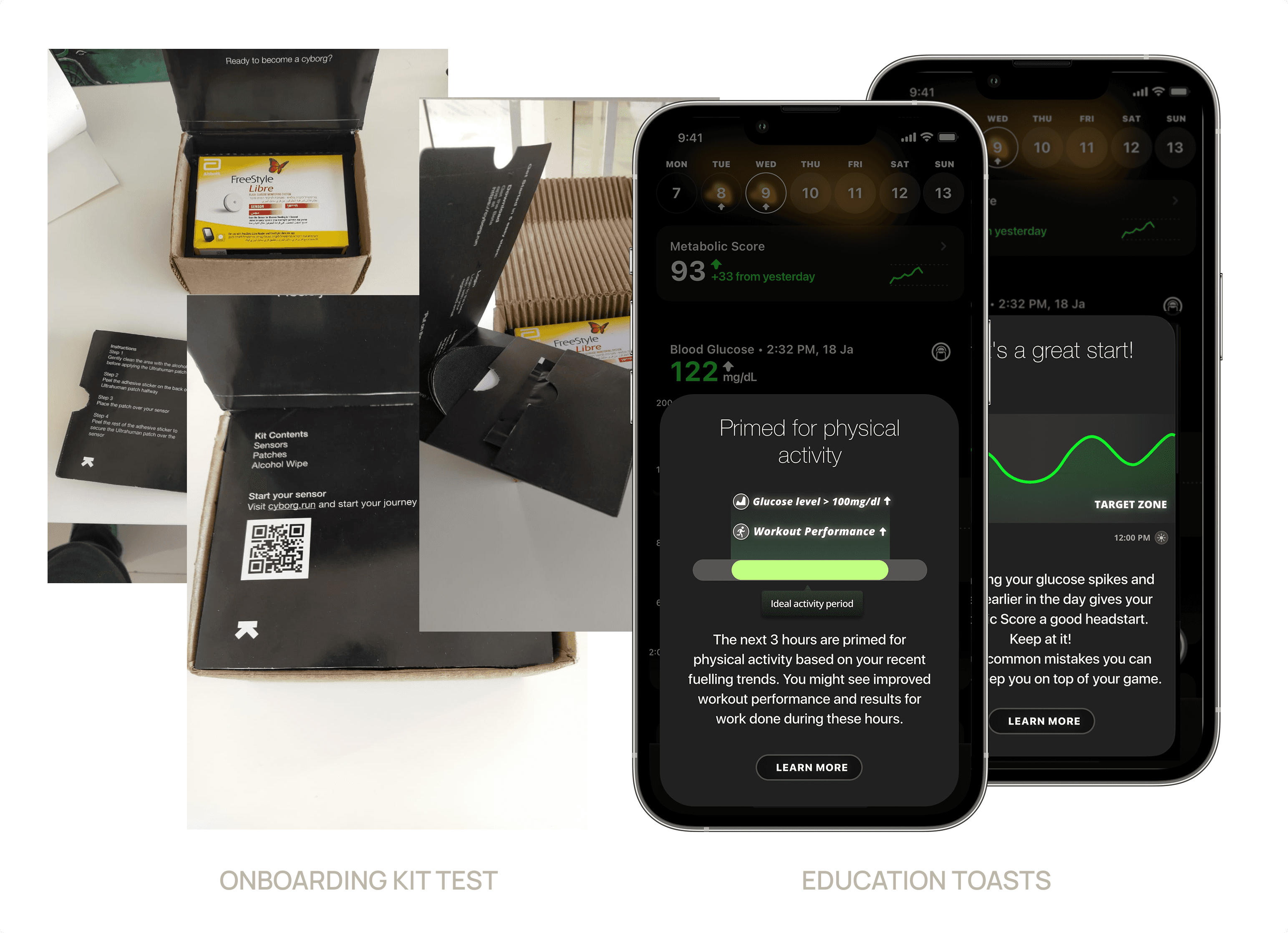
I identified that the biggest friction point was the "First Scan" anxiety. We moved the onboarding flow out of the app and into the physical delivery.
The Scannable Kit: We designed a physical "Scan-Eat-Log" guide inside the CGM box.
Proactive Education: By using Educational Toasts and Pop-ups during the 24-hour sensor "warm-up" period, we addressed technical anxiety before the first data point even appeared.
Anticipating the Spike
Designing with Empathy
Health data is inherently stressful. I conducted interviews with both non-diabetic fitness enthusiasts and health-focused users to define a "Sympathetic Voice."
"Spikes feel like personal failure" + "I log once, never again."
Breakthrough: Anticipate emotional reaction > explain the spike.
Diabetics need "You're safe" reassurance
Biohackers want velocity + duration breakdowns
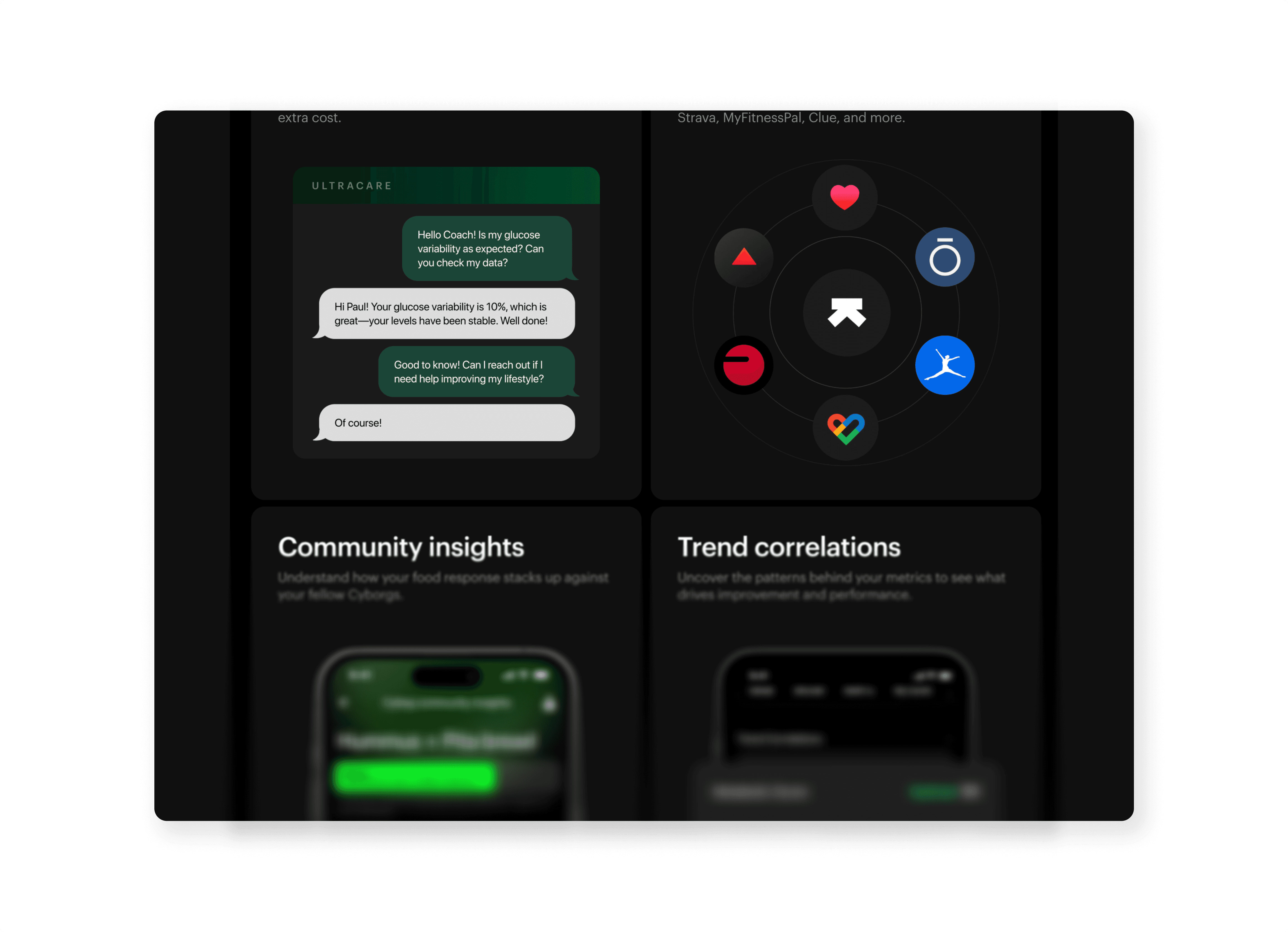
The Nudge Logic: We worked with doctors and nutritionists to build a "Response Library."
High Spike? Instead of an alarm, we show a Contextual Suggestion: "A quick 10-minute walk could help blunt this rise."
Stable Glycemia? We trigger Encouraging Notifications: "Steady as a rock! That meal was metabolically perfect for you."
Gamification & Metabolic Logic
How much data is "Too Much"?
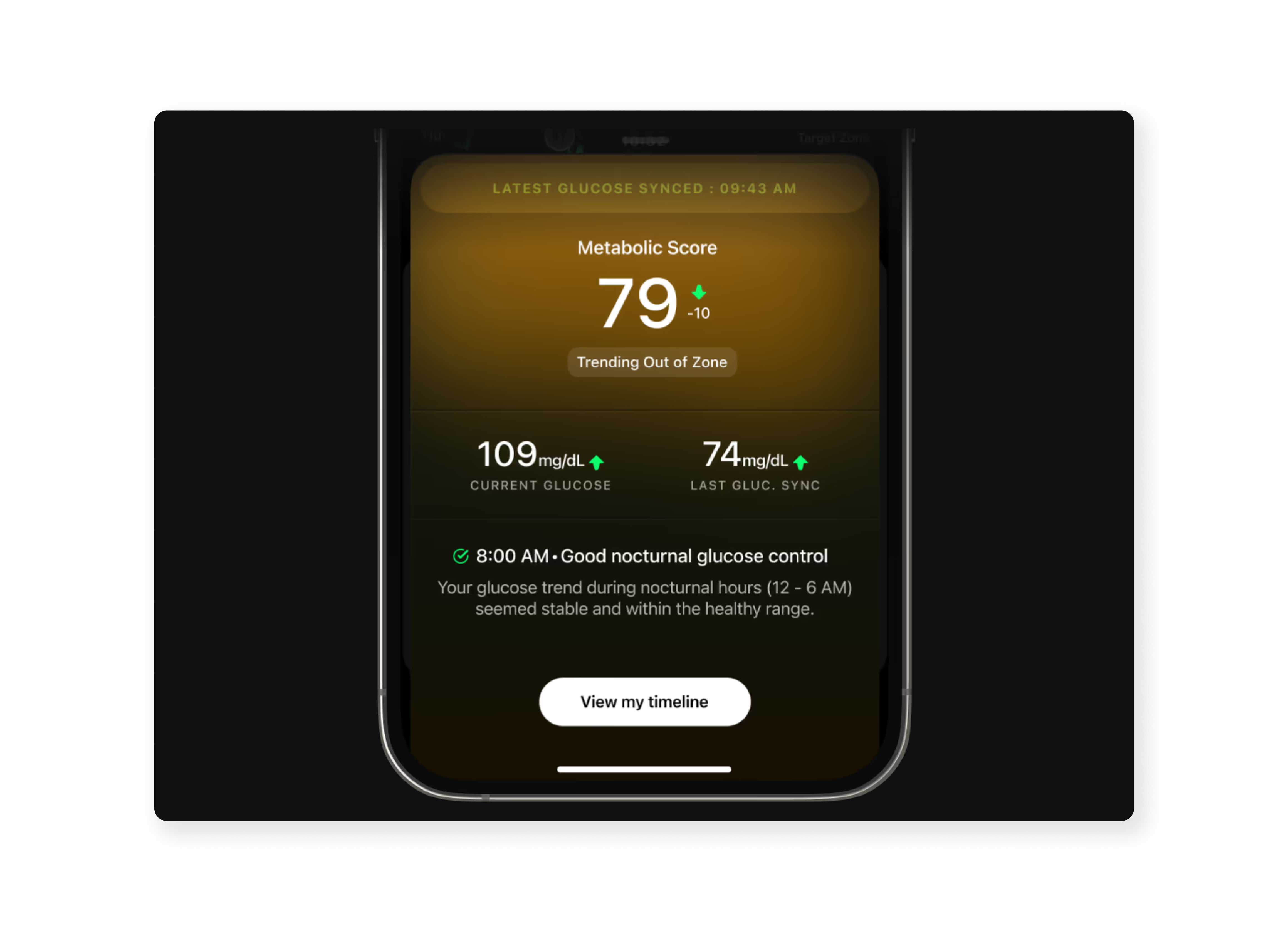
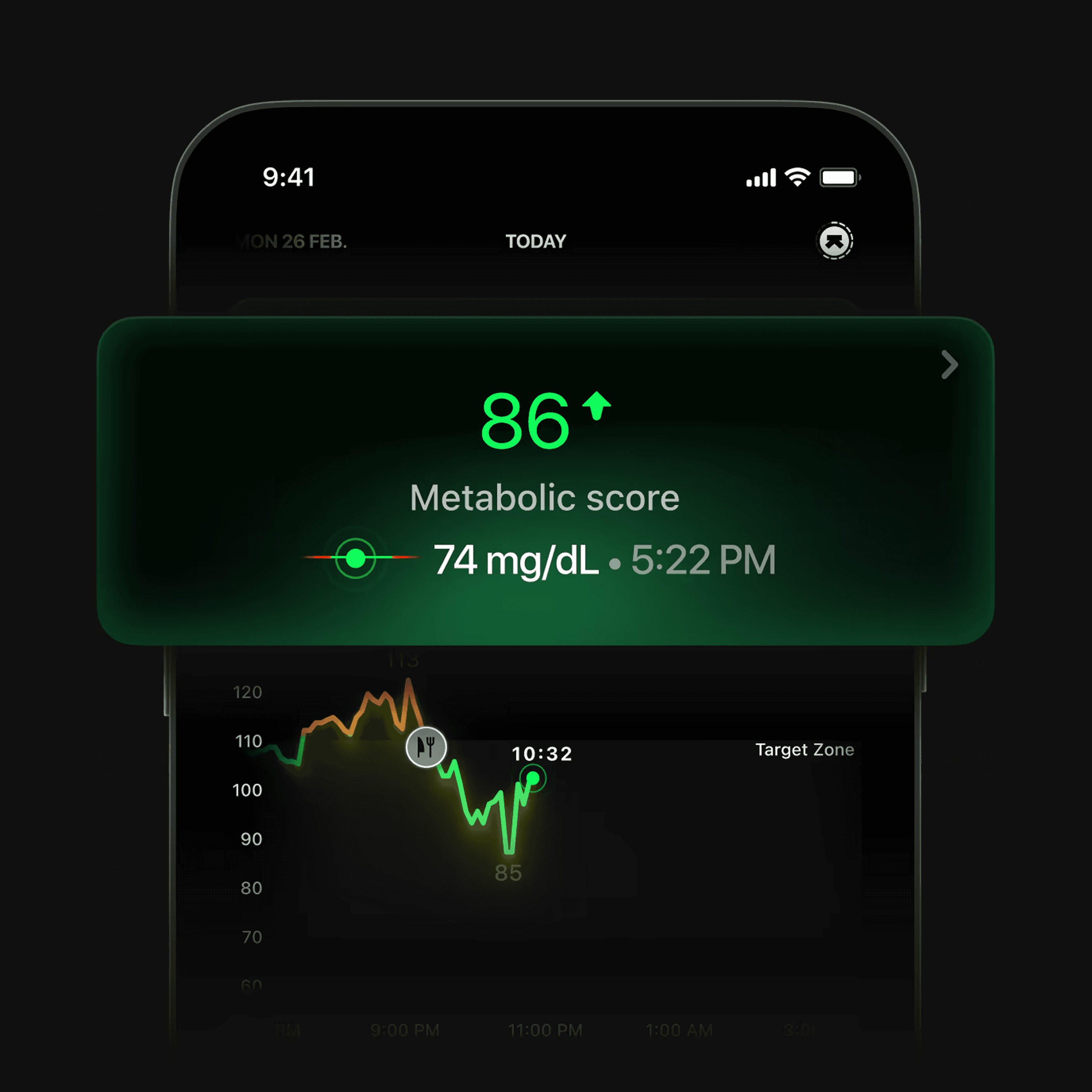
To prevent overwhelm, I implemented a Tiered Information Hierarchy. We replaced raw numbers with a 1-10 Metabolic Score as the primary hook.
The Dopamine Loop: Gamifying the "Food Score" gave users a reason to log. They began chasing an 8+ score, turning a chore into an experiment.
Clinical Anchors: For users who wanted depth, a single tap expanded the score into "Velocity" and "Area Under Curve" metrics. This ensured the app remained "Accurate, not Dumber."
Learnings & Reflections
Friction as Education: Sometimes, a well-timed pop-up (friction) is actually a feature if it provides "Just-in-Time" education.
The Voice of Health: Talking about health requires a balance of clinical authority and human sympathy. We learned that the "Why" is always more important than the "What."
Reduced 67% Support Tickets
Proactive educational toasts solved 1000+ monthly inquiries
8% to 52% Logging Activation
Moved from passive observation to active users.
NPS +23 for Data Clarity
Users reported feeling "empowered" rather than "scared" by their spikes.
Overview
Metabolic health is the quiet engine of longevity, yet our internal chemistry remains a mystery until it fails. Continuous Glucose Monitors (CGMs) promise total transparency, allowing high performers to live better by listening to their blood.
However, raw glucose data lacks immediate meaning. Traditional logging feels like a chore, showing "what" is happening through jagged curves without explaining "why." This causality gap leads to data fatigue rather than behavioral change.
We built a metabolic intelligence system that starts at unboxing. By moving onboarding from the screen to the physical hardware, we created a "Scan-to-Score" loop that feels like magic. Layering AI-driven meal logic over raw sensors allows users to see the "blunting effect" of their choices in real-time—a speedometer for the metabolism.
The result was a 3-tap flow that turned clinical data into an actionable "Metabolic Score." We helped 300,000 users move from passive observation to active optimization, designing a true feedback loop for the human body.
Impact
From Data Overload to Daily Decisions
45% + in Daily Active Logging
Shift in user behavior from passive monitoring to active product engagement.
28% D30 Retention Boost
Redesigned meal-scoring logic provided enough long-term value to keep users from churning after the "novelty phase".
67% Reduction in Support Tickets
proactive educational tooltips solved user confusion before it reached the team.
12% Improved Average Food Score
"Progressive Education" actually helped users make healthier choices over 4 weeks.
The Problem
Physical CGM arrives. Users scan QR → app downloads → "How do I log my first meal?" No contextual education pre-launch. 3,200 tickets/month on "Why did my quinoa spike me?" + "Is 165 bad?"
The ask: Onboard pre-diabetic curious + metabolic nerds without overwhelming clinical data.
My role: Redesigned food logging from delivery box → daily habit. Added scannable education + emotional safety around spikes.
The "Physical-First" Onboarding
Onboarding starts at unboxing
I identified that the biggest friction point was the "First Scan" anxiety. We moved the onboarding flow out of the app and into the physical delivery.
The Scannable Kit: We designed a physical "Scan-Eat-Log" guide inside the CGM box.
Proactive Education: By using Educational Toasts and Pop-ups during the 24-hour sensor "warm-up" period, we addressed technical anxiety before the first data point even appeared.
Anticipating the Spike
Designing with Empathy
Health data is inherently stressful. I conducted interviews with both non-diabetic fitness enthusiasts and health-focused users to define a "Sympathetic Voice."
"Spikes feel like personal failure" + "I log once, never again."
Breakthrough: Anticipate emotional reaction > explain the spike.
Diabetics need "You're safe" reassurance
Biohackers want velocity + duration breakdowns
The Nudge Logic: We worked with doctors and nutritionists to build a "Response Library."
High Spike? Instead of an alarm, we show a Contextual Suggestion: "A quick 10-minute walk could help blunt this rise."
Stable Glycemia? We trigger Encouraging Notifications: "Steady as a rock! That meal was metabolically perfect for you."
Gamification & Metabolic Logic
How much data is "Too Much"?
To prevent overwhelm, I implemented a Tiered Information Hierarchy. We replaced raw numbers with a 1-10 Metabolic Score as the primary hook.
The Dopamine Loop: Gamifying the "Food Score" gave users a reason to log. They began chasing an 8+ score, turning a chore into an experiment.
Clinical Anchors: For users who wanted depth, a single tap expanded the score into "Velocity" and "Area Under Curve" metrics. This ensured the app remained "Accurate, not Dumber."
Learnings & Reflections
Friction as Education: Sometimes, a well-timed pop-up (friction) is actually a feature if it provides "Just-in-Time" education.
The Voice of Health: Talking about health requires a balance of clinical authority and human sympathy. We learned that the "Why" is always more important than the "What."
Reduced 67% Support Tickets
Proactive educational toasts solved 1000+ monthly inquiries
8% to 52% Logging Activation
Moved from passive observation to active users.
NPS +23 for Data Clarity
Users reported feeling "empowered" rather than "scared" by their spikes.